+89%
Dessert sales
From near-zero to consistent sales, simply by adding them to the menu.
Menus for food, drinks, and seasonal cocktails designed for physical prints and digital uses.
Visual language, color and typographical hierarchy appropriate for a contemporary European café.
Parsed and visualized 1,002 daily POS reports to surface revenue insights and better understand business needs.
Designed and built a QR-accessible mobile menu app from scratch in HTML, CSS, and vanilla JavaScript.
A Greensboro staple, redesigned from the ground up
Europa Bar & Café was a beloved restaurant in Greensboro, North Carolina, known for its European-influenced food and atmosphere. This project involved every aspect of its physical branding, refreshing its visual identity and printed menus.
That work was informed by diving deep into Europa's point-of-sale data: 1,002 days of daily sales reports and $1.88 million in tracked revenue, used to understand revenue patterns and help inform operational decisions. The result was the production of three menus that proved more efficient for the restaurant's day-to-day operations.
A palette that reflects the existing interior design
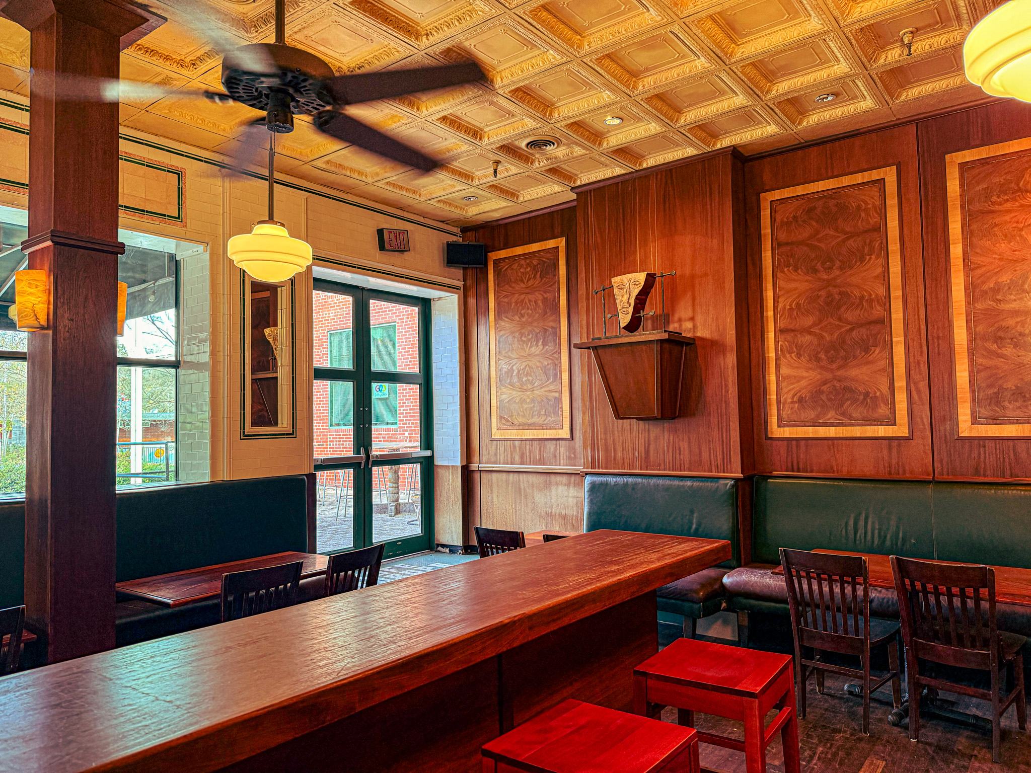
The rebranding draws on the preexisting architecture the restaurant was built in, which shows continuity and intentionality while inviting a more sophisticated, welcoming experience for the guest. Two shades of green anchor the color system with a sense of familiarity, while an off-white creamy grey provides breathing room and contrast.
Type pairs a clean grotesque for hierarchy and labeling with a classical serif for descriptions. The mix is sophisticated without being stiff, mirroring the café's European sensibility.
 1
2
3
1
2
3
#0F4032
Leather banquette seating
#2F7A59
Green entry doors and window trim
#E6E3D9
Pressed-tin ceiling and tiled walls
A QR-accessible mobile menu, built from scratch
In addition to print works, I designed and built a lightweight mobile web app so guests could pull up the full menu from their phones through a QR code upon walking up to the establishment. This was deployed in place of having a fully fleshed out website, so guests can observe our products outside of business hours, or any potential upcoming news since we had yet to have an online presence. It was written from scratch in plain HTML, CSS, and vanilla JavaScript, with no frameworks and no build step, rendering the food, drink, and seasonal menus as crisp, scrollable pages that mirror the print design exactly.
The app was deployed in April 2026 and ran for about two weeks before the business closed unexpectedly, so there is no long-term usage data to point to. What it shows is the interaction design and front-end build as a fast, frictionless, native-feeling menu that carries the brand as carefully as the printed booklets do.
A five-year study of guests, turned into design
Rather than conducting formal user research, this redesign was built on five years of direct observation as a server and bartender at Europa. Noticing the usual friction play out every shift shaped much of what would become the redesigned menus.
The result is a set of menus whose design choices answer specific operational and sales problems, and that anticipate questions before guests have to ask them.
Vague descriptions leading to lost sales
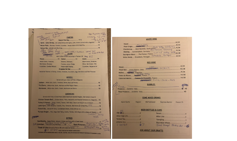
The Salmon Dip carried the minimal description "served with pita chips." Guests ordered it blindly and were occasionally surprised it arrived hot, loaded with cheese, and topped with breadcrumbs. Anyone with lactose intolerance, a gluten allergy, or simply different expectations would send it back, wasting a perfectly good product that clearer communication could have saved.
The Mezze Plate failed to mention its olives, pepperoncini, and feta, reading as vague and unappealing: "hummus, tzatziki, cucumber-tomato salad with grilled pita." Both items underperformed.
Operational drag from repetitive questions
Answering these pulled a server off the floor during every rush.
Items buried, invisible to guests
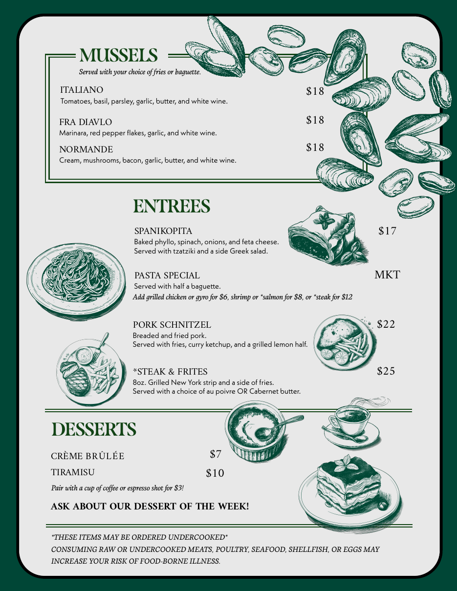
The entrées section was compressed at the bottom of the menu with no visual breathing room. Pasta was overwhelmed by surrounding items with heavier, more elaborate descriptions. Desserts weren't on the menu at all. They only sold if a server remembered, or had time, to mention them.
Missing information that created surprises
PBR was listed without its size; many assumed roughly 16oz, then were caught off guard when a 25oz can arrived. Rosé and Prosecco availability wasn't clear (glass only, bottle only, or both), leading to disappointment when tables had to be corrected on a misled assumption. These small gaps eroded trust.
The creation of a separate booklet
The most significant structural change was to separate food and drink into their own menus. Guests who came in just to drink no longer had to navigate a food-forward menu; instead, they were handed a small black booklet holding every beverage option, intimate, legible, and self-contained.
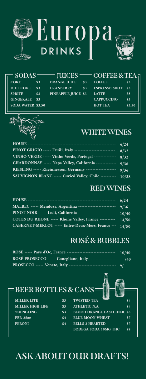
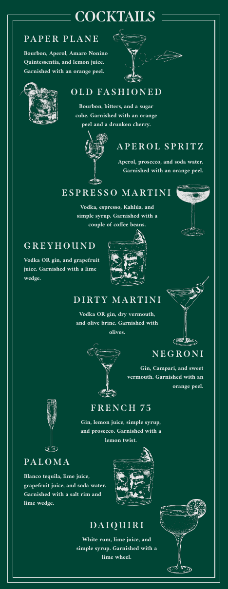
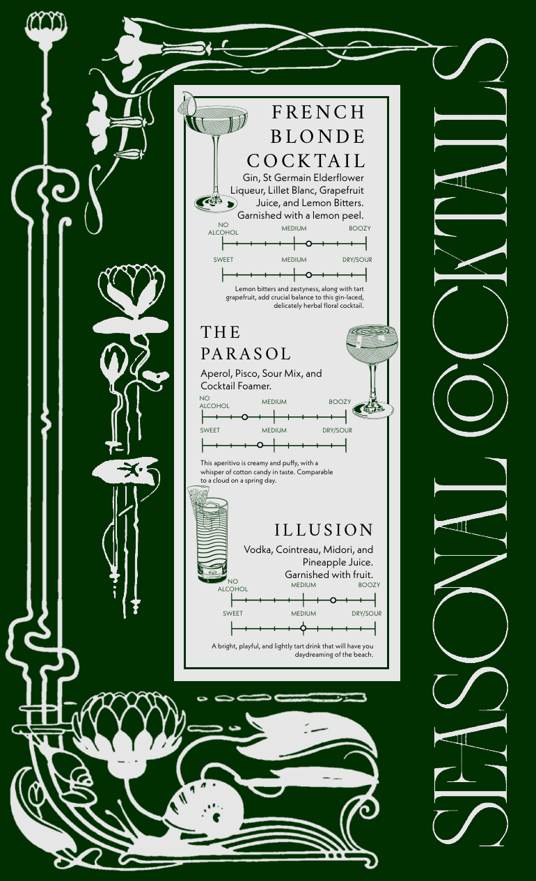

Descriptions cultivated to answer questions
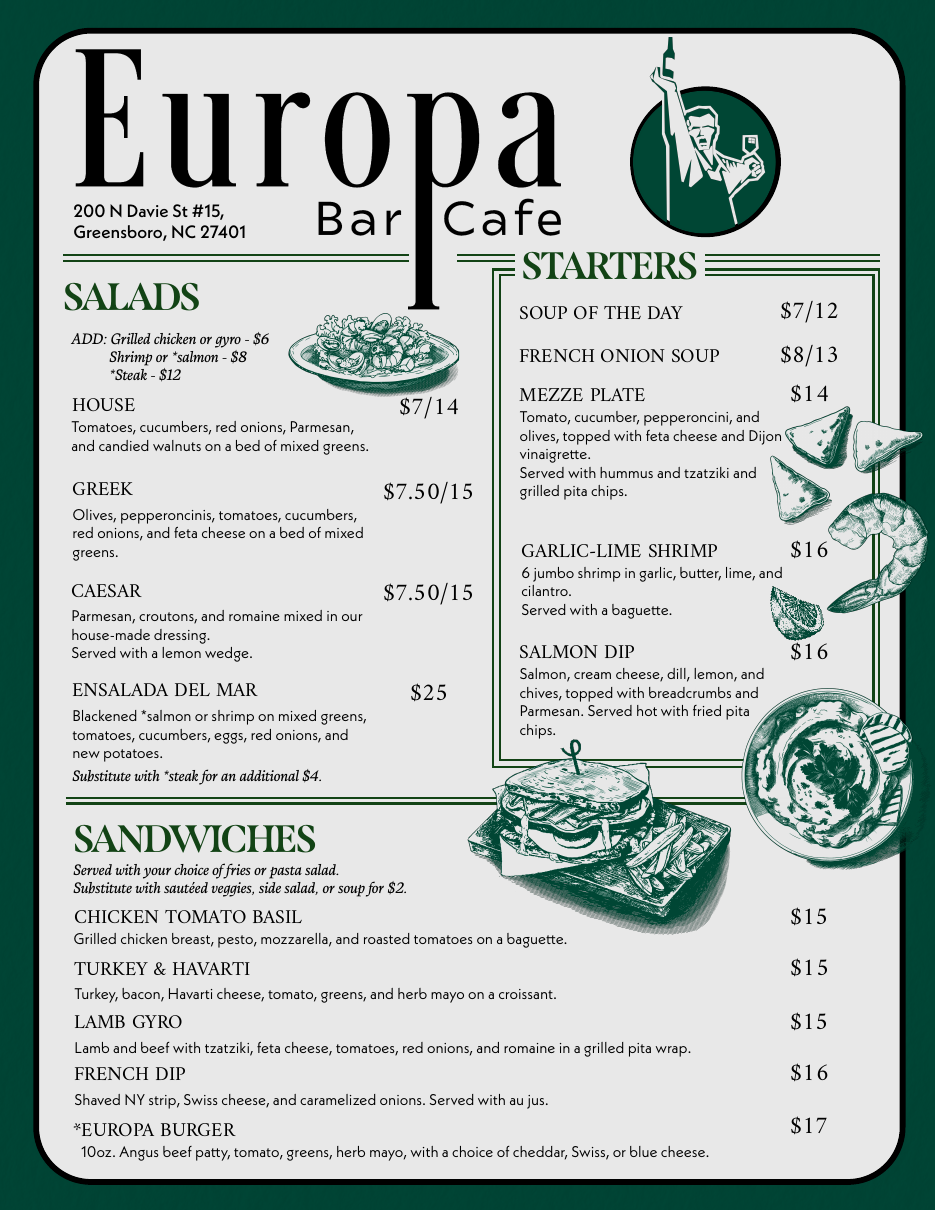
The renewed food menu uses both sides of the page, which frees up space to give the entrées room to breathe and adds illustrations that make potentially unfamiliar items approachable. Every rewrite was informed by a specific question guests kept asking.
Three years of daily revenue, made legible
Europa's point-of-sale system generated a daily sales report for every day of service. I parsed 1,002 of these reports, spanning January 2023 through April 2026, to surface trends in food and beverage revenue, peak periods, and overall performance.
Challenging variables, leading to growth
The business experienced inconsistent hours from occasional closures and inventory gaps that stemmed from internal operational struggles, leaving a damaged reputation among regulars.
Consistent 11:30am–9pm hours and a polished guest experience, aided by the new brand identity, redesigned menus, and a restructured commitment to operational consistency, all deployed in September 2025.
Stabilization became evident: the first month to show clear year-over-year revenue growth.
Rebuilding trust
This wasn't a straightforward "redesign → revenue up" story. Europa entered 2025 with reputational damage from 2024's operational inconsistency, and the design work was part of a broader stabilization effort. The year-over-year numbers are transparent about that context, until December 2025, where the trajectory turns upward. The event-day data reveals a major opportunity that the new visual-communications strategy is built to address.